The ONE Marketing Magazine
10 years of agency knowledge on social media, ads and AI - for SMEs and enterprises.
 Published by Stephan M. Czaja




News
The latest posts - fresh after the top stories.

B2B Marketing: Definition, Channels, and the Difference from B2C
What sets B2B marketing apart as a discipline, how it differs from B2C marketing, and…

Sales: Definition, Sales Process, and Social Selling
What sales really means as a business function, how a classic sales process unfolds, and…

CPA (Cost per Action): Definition, Formula, and Difference from Cost per Acquisition
CPA (Cost per Action) is a pricing model where you only pay for a defined action. We…

Video View: Definition, Platform Differences, and Watch Time Compared
A video view means something different on YouTube, Facebook, Instagram, and TikTok. We…

Sales Message: Structure, Examples, and the Impact of Strong Copy
What makes a compelling sales message, how it's structured, and why it decides whether an…
Word of Mouth: Referral Marketing, Recommendations, and Trust as a Sales Argument
Why word-of-mouth recommendations feel more credible than advertising, and how referral…

Case Studies: Structure, Social Proof, and Use in Marketing
Case studies are one of the most credible forms of proof in marketing. We show you how a…

Webinars: B2B Leads, Live Formats, and the Perfect Structure
Webinars are among the most effective tools for B2B lead generation. We show you how live…

Social Media Videos: Reels, Stories, and Formats for Strong Reach
Social media videos have long been the most important content format in digital…
Cases
Success stories and campaign results from our clients.
Luxury Fashion TikTok
TikTok content production for luxury fashion brands Balenciaga and Off-White — shooting accompaniment, BTS c…

179+ Ads, Partnership Extended
11+ campaigns with 179+ individual ads — performance-driven creative engagement that led to an extended part…
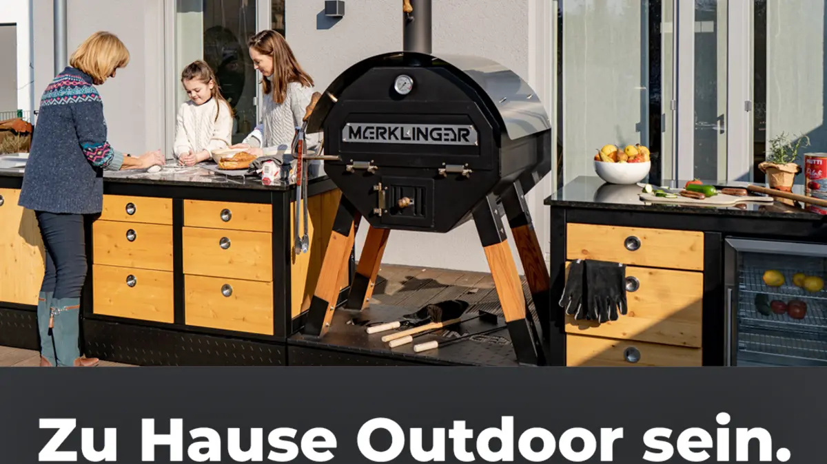
7x ROAS for Artisan Oven Brand
A Bavarian wood-fired oven manufacturer scaled from 8 to 200 monthly sales through USP-focused campaigns — g…

4.86M Traffic — 28 Creators
Large-scale influencer campaign for Hoover across 4 product lines (HFX, HF9, HW5, HMC5) — 28 creators genera…
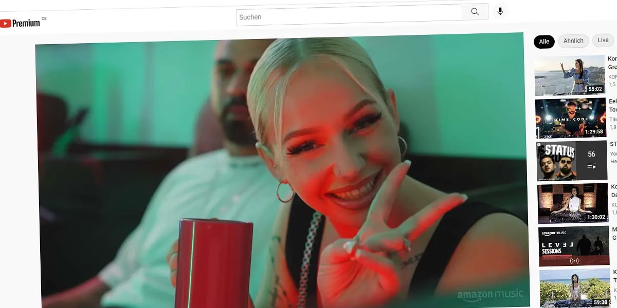
Hip-Hop Documentary Campaign
Documentary production for Amazon Music — capturing the life story of musician Kabal for a multi-channel hip…
1M+ Reach — Family Lifestyle
Influencer campaign for My Junior baby products — 3 creators with travel logistics integration generated 1M+…
CM Built from Scratch, 6 Platforms
Complete community management build-up from scratch for UNICEF across 6 platforms — from Instagram to TikTok…
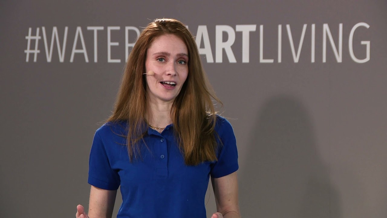
2.6M TV Reach — Sandra Hunke
Brand ambassador management for Hansa Coffee featuring Sandra Hunke — TV reach of 2.6M through productions, …
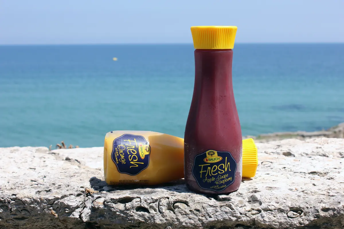
5 Brands, 13 Countries
Multi-country social media management for 5 sub-brands (BRAVO, HAPPY DAY, JUICE BAR, MYTEA) across 13 countr…
KI und Zukunft
AI, automation and tomorrow's marketing trends.

AI Sales Software: Comparison of Features, Providers, and ROI
AI-powered sales tools promise more leads, shorter sales cycles, and less manual work…

Meta Advantage+: AI campaigns on Facebook and Instagram
Meta Advantage+ has fundamentally changed the way Facebook and Instagram advertising…

Robots in Marketing: How Technology and Automation Are Transforming Brands
Robots are no longer confined to factory floors—they’ve made their way into marketing…

Anthropic: The Company Behind Claude, Explained Simply
Anthropic is the American AI company behind the language model Claude and, alongside…

Perplexity: The AI Search Engine That Cites Sources—Explained Simply
Perplexity is an AI search engine that answers questions directly with a clear response…

AI Training Data: How Language Models Learn and What That Means for Websites
Every language model, such as ChatGPT, has been trained on massive amounts of digital…

Language Model (LLM): Definition and Importance for SEO/GEO
A language model—often referred to as an LLM (Large Language Model)—is the technology…

AI Systems: An Overview of ChatGPT, Perplexity, and Gemini
These days, when someone asks a question, they’re increasingly likely to find a fully…
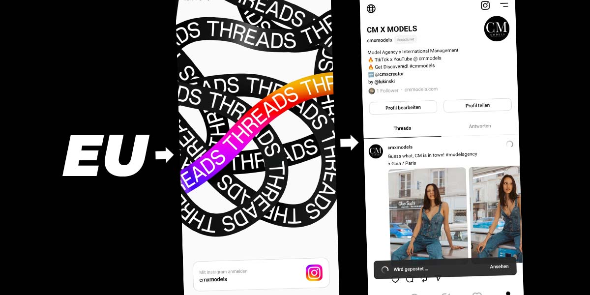
K-Pop Marketing: How the Korean Pop Wave Is Changing Brands
K-Pop is more than just music —it is an industrially perfected marketing ecosystem that…
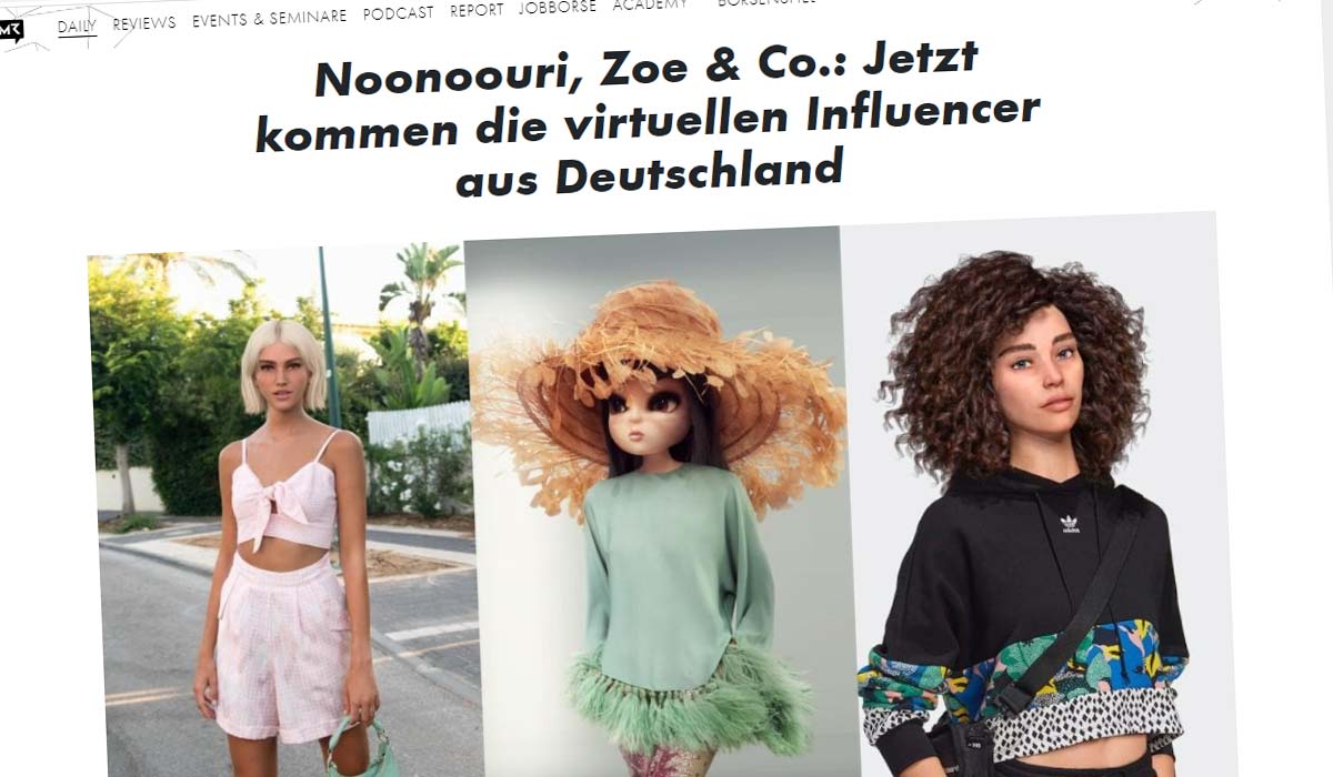
Pop Culture in Marketing: How Brands Use Trends, Memes, and the Zeitgeist
Pop culture and marketing have become inseparable. Brands that capture the spirit of the…

Generative AI Models: How ChatGPT, Perplexity, and Google AI Overviews Are Changing Visibility
Generative models generate their own, tailored responses to a query—rather than simply…

Trade fair agency: Trade fair stand, construction, marketing, advertising - Our agency
Why coordinate three different agencies when just one can guarantee overall success?…
Recruiting & Fachkräftemangel
Finding and keeping talent: employer branding, active sourcing and social recruiting.
B2B Lead Generation: More Qualified Leads
Qualified B2B leads are the foundation of any sustainable business growth—and at the same…
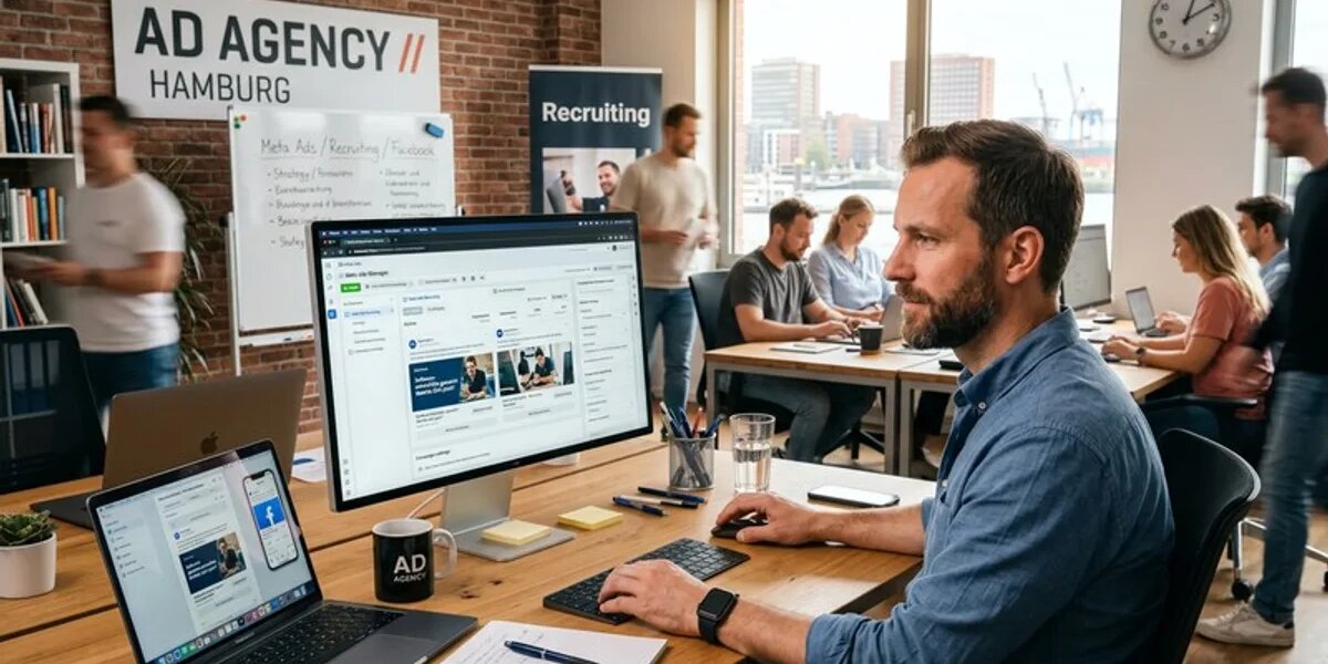
Skilled Labor Shortage in SMEs: Finding, Retaining, and Attracting Employees
The shortage of skilled workers is hitting small and medium-sized enterprises hard—and…

Optimize Your Job Posting: Attract More Applicants and Better Candidates
Many companies wonder why their job postings generate so few applications—even though the…
Meta Ads Recruiting: Job Postings, Targeting, and Social Recruiting
Job openings remain unfilled for months, traditional job portals barely yield any…

Job Portal Comparison: Indeed, StepStone, and LinkedIn for SMEs
Postingjob ads and hoping for the best—that’s a thing of the past. Today, any…
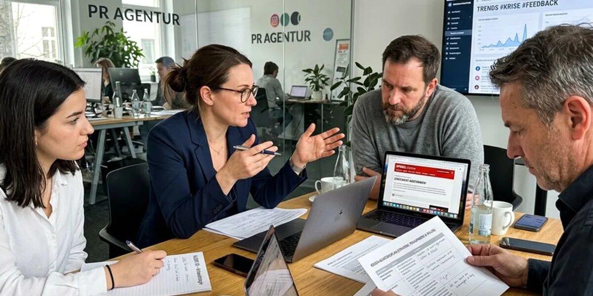
Employer Branding for SMEs: Employer Brand, Attracting and Retaining Employees
A shortage of skilled workers, tight budgets, and direct competition with major brands…
Employee Retention: SME Initiatives and Skilled Workers
For many small and medium-sized businesses, employee retention is no longer just a…

Candidate Experience: Optimizing the Application Process, Recruiting & Talent
Many medium-sized companies lose qualified candidates not because they lack appeal as…
LinkedIn Recruiting: Attracting Talent, Generating B2B Leads, and Driving Growth
A shortage of skilled workers and empty order books at the same time—for many B2B service…
Active Sourcing: SME Strategy, Direct Outreach, and Talent Acquisition
The job market has undergone a fundamental transformation: Qualified professionals no…

Social Media Marketing for the Logistics Industry
Logistics companies often face a twofold challenge: They must attract new customers for…

Recruiting marketing: Attracting talent via social media
Qualified specialists are becoming scarcer, the competition for talent tougher: over 70…
Mehr Reichweite, mehr Sales
Performance marketing, SEO and campaigns that provably drive revenue.
Cost per Acquisition (CPA): Calculation, Formula, and Difference from CAC
Cost per Acquisition (CPA) shows what acquiring a new customer really costs you. Formula…
How-To Content: Using Tutorials, Guides, and Search Intent Effectively
How-to content delivers exactly what users are actively searching for: a clear guide to a…

Organic Rankings: Ranking Factors, Backlinks, and Content Quality
Organic rankings determine your visibility in unpaid search results and depend on content…

More Website Visitors: Channels, Leverage Points, and Metrics
More visitors to your website aren’t an end in themselves—they only matter if they belong…
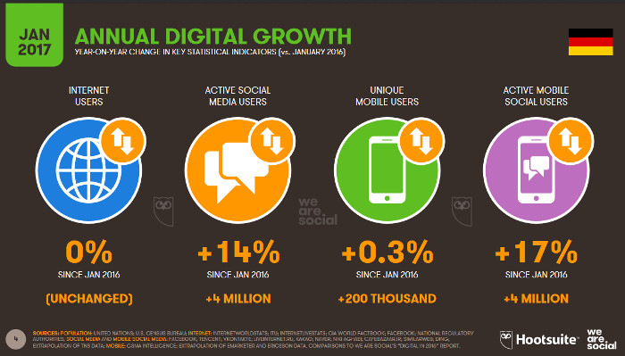
More Sales: Leverage and Key Metrics for Increased Revenue
More sales don’t automatically mean more traffic or more leads—they mean more closed…

McDonald's Soccer Cups: Collectible Campaign, Schweinsteiger, and Samuel Jackson Under the Marketing Microscope
Some campaigns work just once. McDonald’s soccer cups work time and time again…
More Downloads for Your App: 15 Strategies for ASO, Paid, and Organic
Getting more app downloads isn’t a matter of chance—it’s the result of a…

YouTube Pre-Roll Ads: Formats, Costs, and Impact
YouTube pre-roll ads are video ads that play before the video the viewer has actually…
Fast Food Marketing: Strategies, Advertising, and the Secrets to Success of Major Chains
McDonald’s doesn’t sell burgers—McDonald’s sells experiences…
QSR: Quick-Service Restaurant Marketing for Fast-Food Chains
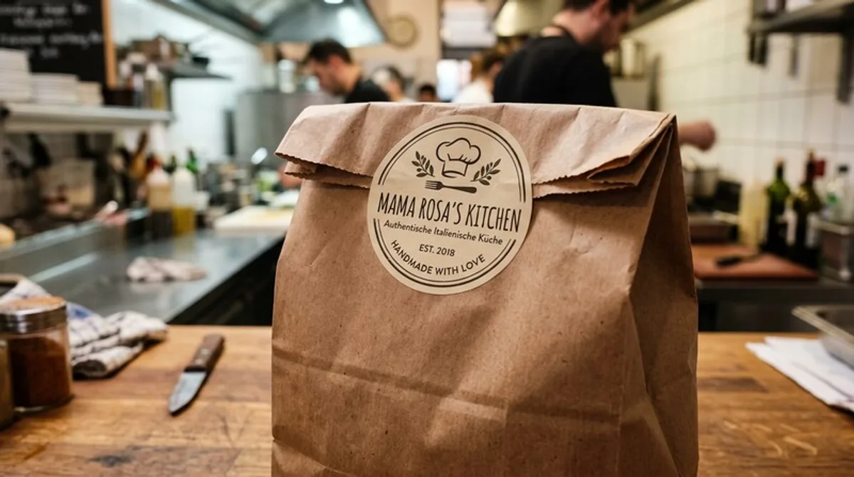
QSR stands for Quick Service Restaurant and refers to the business model of fast-service…
Visibility: What Really Makes Companies Visible on Google
In marketing,visibility describes how present a brand or website is where its target…

Performance Max: The Automated Google Ads Campaign Type
Performance Max is an automated campaign type within Google Ads that uses a single…
Für Unternehmen
Online shop, newsletter and email marketing for your company.

Cross-Selling and Upselling: Difference, Examples, and Strategy
Cross-selling grows the cart, upselling grows its value. We explain the difference, share…

Private Label: Significance, Strategy, and Competition with Manufacturer Brands
Over the past two decades, private-label brands have evolved from being merely low-cost…

Private Label: Development, Benefits, and Strategies in E-Commerce
For online retailers, private labels in e-commerce are no longer optional—they’re a…

Retail Marketing: Strategies, Channels, and Customer Loyalty in the Retail Industry
The retail industry is undergoing constant change. While e-commerce is gaining…

Retail: Definition, Trends, and Strategies in Modern Retail
The retail sector is undergoing a fundamental transformation. What used to be purely…

Singles' Day: The World's Largest Shopping Event and What Brands Can Learn From It
Every year on November 11, China transforms into a massive digital shopping mall—and the…
Shopping Event: How Brands Use Events to Create Shopping Experiences and Drive Sales
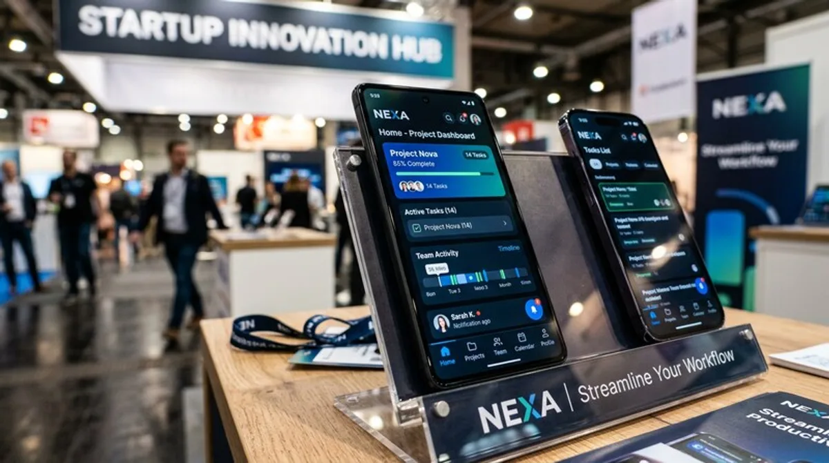
Clicking “Buy” takes just a moment—but what sticks in your memory? Brands seeking lasting…
Creative Teams in Advertising: Roles, Processes, and Creative Collaboration
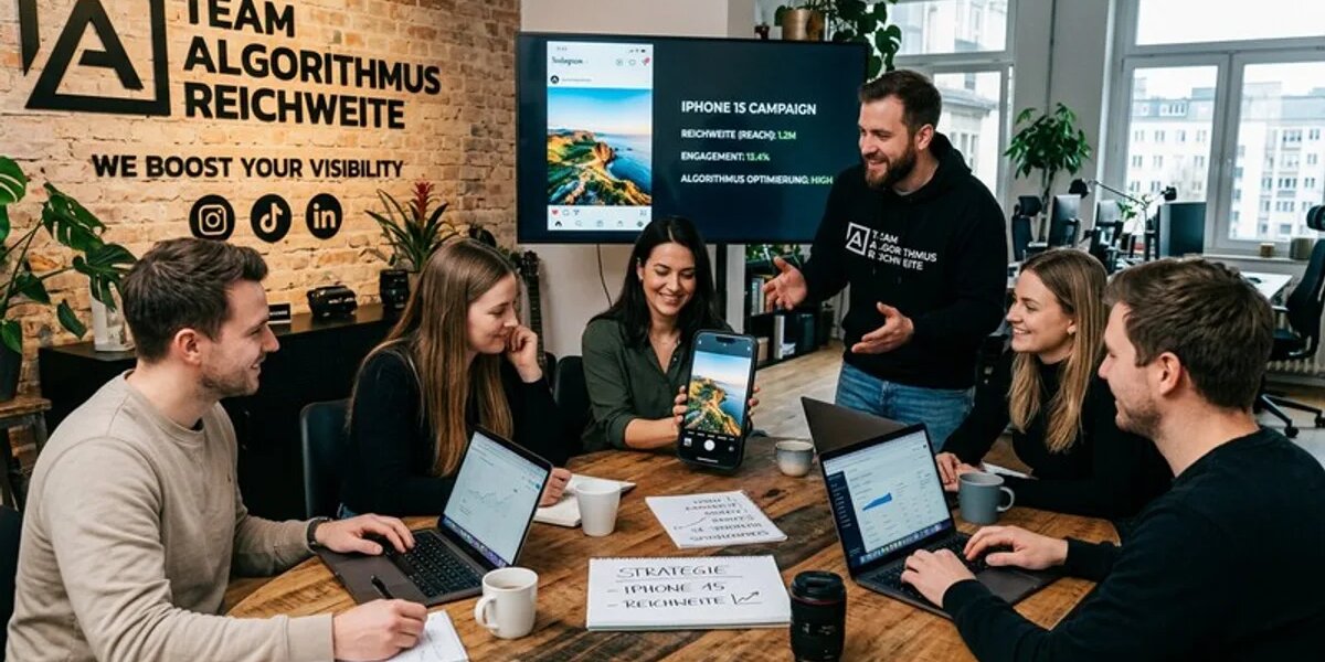
Behind every iconic campaign is not a single genius—but a well-coordinated team that…
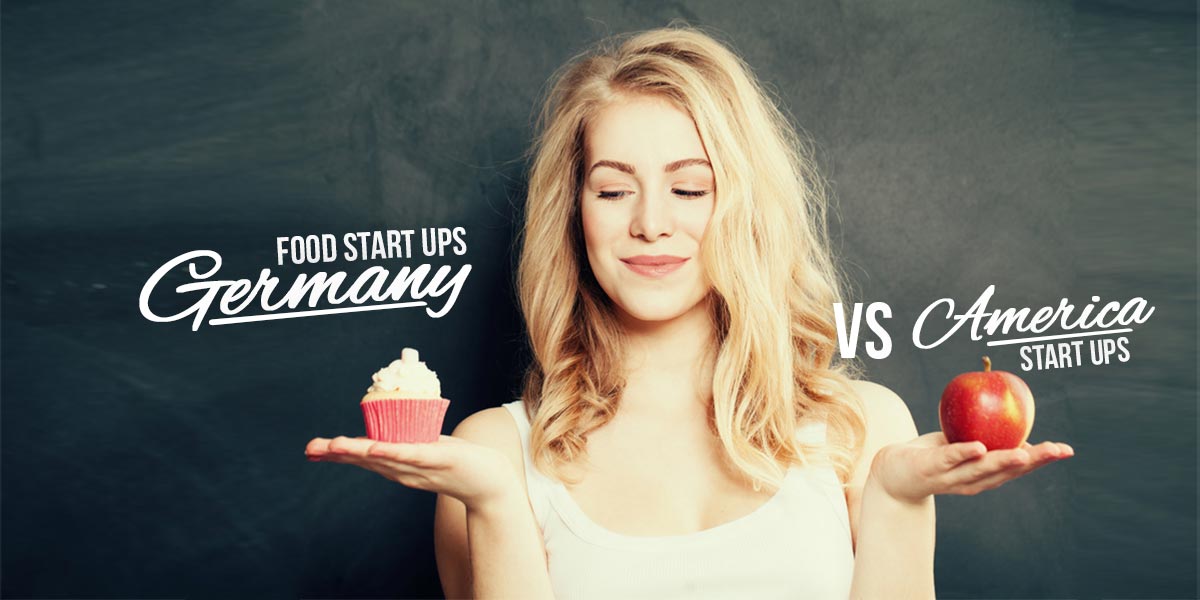
Countdowns in Marketing: Urgency, Scarcity, and Time-Based Campaigns
Three, two, one—and sales skyrocket. What sounds like a magic trick is actually applied…
Discount Promotions in Marketing: Strategies, Psychology, and Success Factors
Anyone who still believes today that a large sale banner is enough to sustainably…

Black Friday Marketing: Strategies, Campaigns, and How Brands Can Capitalize on the Big Sale Day
No single day of the retail year brings together as many marketing decisionsat once as…

Media Coverage: Generating Earned Coverage and Optimizing Public Relations
While many brandsinvest millions in paid advertising, the most valuable medium remains…
Werbung & Content
Out-of-home, streaming ads, content production, short-form video and social media.

Influencer PR: Earned Media Through Collaborations with Opinion Leaders
Traditional public relations is aimed at journalists, while influencer PR extends this…

PR Tools: Software for Monitoring, Analysis, and Public Relations
PR tools automate precisely the tasks that traditional public relations used to handle…

More B2B Sales: Leads, LinkedIn, and Sales Strategy
B2B sales rarely result from spontaneous purchases, as they do in traditional…
Increasing Reach: The Most Important Leverage Points for Each Channel
For most companies, greater reach is the primary goal of any social media and content…

Influencers in Marketing: How Brands Use Influencers to Expand Their Reach
A single message that reaches the right people at the right time—and suddenly, an entire…

More Likes on Social Media: What Really Leads to More Engagement
Likes are the smallest but most visible signal on social media—and for the algorithm…
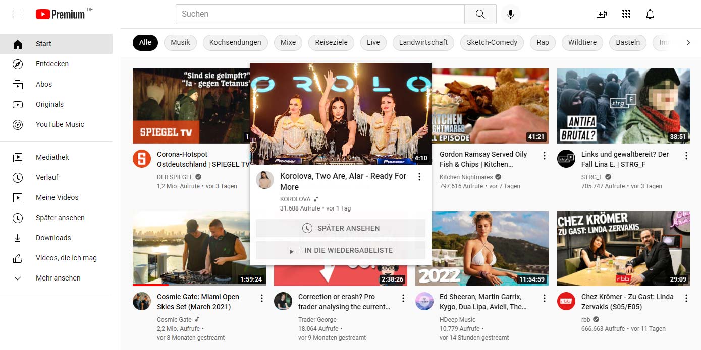
YouTube Streaming in Marketing: Live Events, Product Launches, and Community Building
Millions of viewers, zero broadcasting costs, maximum authenticity — YouTube Live has…

Coca-Cola: Share a Coke - Viral Video Marketing Case Study
Die Personalisierungskampagne mit Namen auf Flaschen verwandelte ein Massenprodukt in ein…
GEICO: Hump Day - Viral Video Marketing Case Study
Ein Kamel stapft durchs Buero und fragt Guess what day it is? - der einfachste Witz der…
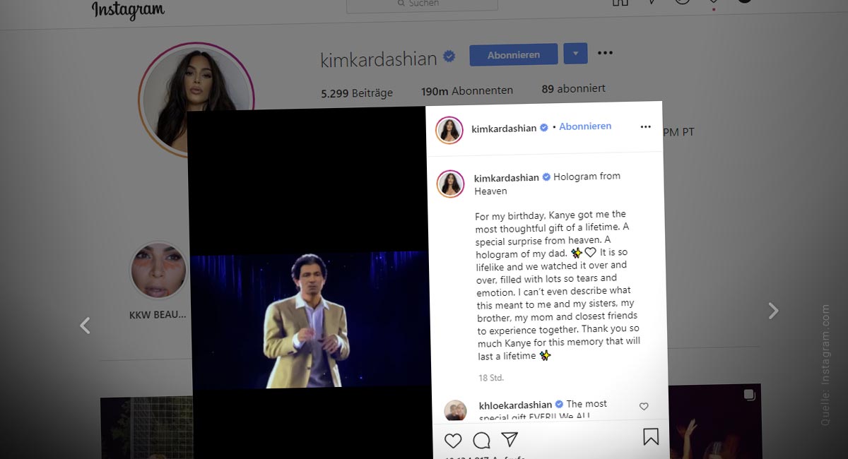
Live Commentary in Marketing: Real-Time Community Engagement
While the stream is running, the community is commenting—and it’s precisely at that…

Developing a Social Media Strategy: Case Study on Product Reviews and ABC Analysis
Who are you? That’s the big question. Do people love the brand, or do they just use it?…

LinkedIn Lead Generation: Attracting New Customers on LinkedIn
LinkedIn has long been the most important platform for B2B lead generation in…
No posts found for this search.
Guides. News. Trends – by Stephan
Partner


 4.9 / 5.0
average of the last 12 months. Survey after consultation – online, by telephone or on site.