Visual Language in Marketing: How Visual Communication Shapes Brands
Images communicate faster than any text—the human brain processes visual information up to 60,000 times faster than language. Visual language in marketing is therefore not merely an aesthetic embellishment, but a strategic tool that directly influences brand perception, emotions, and

What Is Visual Language? Definition
Here’s what it’s all about:
- Visual Language in Marketing: Explained Briefly and Clearly
- Distinction from Related Concepts
- The foundation of every marketing strategy
Visual language refers to the systematic, consistent set of visual elements a brand or organization uses to communicate. It encompasses color palettes, image compositions, thematic worlds, stylistic elements, and the overall emotional impression created by photos, illustrations, or videos. In content marketing, visual language is the visual component of a brand’s voice: it conveys values, positioning, and personality in a fraction of a second. A coherent visual language ensures that users can immediately recognize a brand’s content even without a logo—an enormous
Core Principles of Visual Identity
Strong visual language is based on four core principles: consistency, relevance, differentiation, and emotion. Consistency means that all visual elements follow the same rules—regardless of whether an image is produced for an Instagram Story, a display ad, or a print flyer. Relevance ensures that the chosen aesthetic aligns with the target audience: A youth brand that uses glossy stock photos from the 2000s immediately loses credibility. Differentiation creates visual uniqueness in the market—the question is: Does our visual content look like that of all our competitors, or do we have a distinctive style? Finally, emotion is the decisive factor: Images that evoke no emotion are forgotten.
Distinction: Visual Language vs. Corporate Design
Visual language and corporate design are often confused, but they are not the same thing. Corporate design encompasses a brand’s entire visual identity—logo, typography, color system, formats, and design grids. Visual language is a subset of this and refers specifically to the way photos, illustrations, and moving images are designed. A company can have a perfect corporate design manual and still have an inconsistent visual language because photographer briefings are missing or because visual material from different sources is thrown together haphazardly. Visual language is thus the practical application of corporate design in the realm of visual content—it requires its own guidelines, its own quality control, and often its own briefing system.
| Aspect | Description |
|---|---|
| Color Scheme | Defined primary and secondary colors, contrast levels, and emotional color associations |
| Subject Selection | Which objects, people, scenarios, and settings may appear in images |
| Composition Style | Symmetry vs. Asymmetry, Negative Space, Framing, and Perspective |
| Image Editing | Exposure, contrast, saturation, filter effects, and level of retouching |
The Importance of Visual Language in Marketing
In a nutshell:
- Using Visual Language in Marketing Strategically and Purposefully
- Always keep the target audience and context in mind
- Continuously test and improve
In a world where users decide within milliseconds whether to engage with content or keep scrolling, visual language through visual content marketing is the first—and often decisive—point of contact. Brands with a clear, consistent visual language have been shown to achieve higher recognition rates, stronger emotional connections, and better conversion rates. Visual language translates abstract brand values—trust, innovation, sustainability—into visible, tangible aesthetics. Especially on social media and in performance marketing, visual appeal determines whether an ad is even noticed.
The Emotional Impact of Visual Communication
Images activate the limbic centers of the brain, which are responsible for emotions and memory. An image that conveys warmth, security, or inspiration links these feelings to the brand—often more lasting than any slogan. Employer branding campaigns deliberately leverage this effect: Authentic images of employees build more trust than glossy, staged photos.
Facts & Figures: Why Visual Quality Seems Measurable
The impact of visual content can not only be felt but also measured. According to a study by Venngage, 65 percent of people process information primarily through visuals—which means that text alone does not effectively reach the majority of the target audience. HubSpot data shows that social media posts with high-quality images generate up to 650 percent more engagement than text-only posts. In email marketing, relevant images increase the click-through rate by an average of 42 percent. For performance campaigns, Facebook’s own studies show that ads with visual elements tailored to the target audience achieve cost-per-click rates that are up to 35 percent lower. Visuals are therefore not a soft factor, but a hard revenue driver.
Brand Recognition and Brand Consistency
Consistent visual language significantly increases brand awareness. Studies show that a consistent visual identity can boost brand awareness by up to 80 percent. This means that every photo, every graphic, and every video frame must follow the same style guide rules—from Instagram posts to landing pages.
Strategies: How Brands Use Visual Language
Here’s how it works:
- Clearly define your goals before you start
- Strategically integrate visual elements into the marketing mix
- Test, measure, and continuously optimize
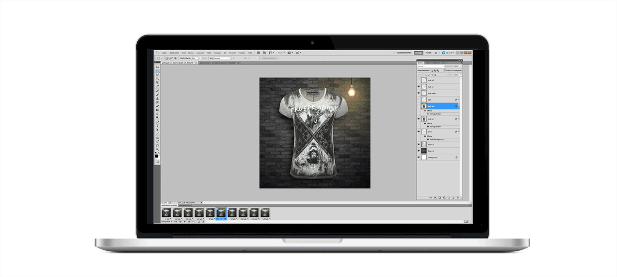
Successful brands don’t develop their visual language by chance—they do it strategically. The first step is a brand photography briefing: It specifies which motifs, colors, lighting moods, and people may appear in the images—and which may not. This is supplemented by a visual style guide that documents all visual elements and makes them accessible to agencies, photographers, and internal teams.
For social media marketing, this means that each platform receives a tailored version of the core visual language. Instagram requires aesthetic consistency in the feed grid, TikTok favors an authentic, less staged aesthetic, while LinkedIn tends to reward professional, bright, and clear compositions. Cross-media marketing requires that the visual language remain recognizable across all touchpoints—from billboards to push notifications.
Another tool is visual language analysis: Using tools like Google Vision or proprietary image analysis software, you can measure which visual elements generate the highest engagement rates among your target audience. This turns visual language into a data-driven, optimizable marketing lever rather than a purely subjective creative judgment.
- Brands develop visual language strategically, not randomly.
- A Brand Photography Briefing defines permitted motifs.
- A Visual Style Guide documents all visual elements.
- Each social media platform requires a tailored visual language.
- Visual language must remain consistent across all touchpoints.
- Image analysis tools measure engagement rates for visual elements.
Step-by-Step: Creating a Visual Style Guide
A functional visual style guide is created in five steps. First: Brand analysis — Which three to five adjectives best describe the brand? Bold, warm, innovative, trustworthy? These values determine the visual direction. Second: Mood board phase — Collect 20 to 30 reference images that capture the brand’s essence, and analyze which visual patterns recur (lighting mood, color palette, types of people). Third: Document the guidelines — Clearly define: permitted colors, prohibited motifs, composition rules, and editing style (e.g., warm white balance, no HDR, natural skin tones). Fourth: Create photo briefing templates — Every photographer and agency receives the same structured briefing document. Fifth: Establish quality control — Before each publication, a designated person checks whether the image complies with the style guide.
- Brand Analysis: Adjectives Define the Visual Direction
- Compile a mood board with 20–30 reference images
- Guidelines: Document colors, motifs, and compositional style
- Create photo briefing templates for all photographers
- Conduct quality control before each publication
- Analyze visual patterns and lighting moods
- Define and enforce consistent editing styles
Practical Tips: Adapting Visual Language to Specific Platforms
The core visual style remains consistent across all channels, but the execution varies depending on the platform. For Instagram, the feed as a whole is key—a checkerboard pattern of light and dark images or a consistent color palette across all nine feed slots creates a professional impression. For TikTok and Reels, a deliberately more raw, unpolished look is recommended: handheld camera, natural light, and authentic settings. LinkedIn content works best with light backgrounds, clear facial features, and minimal visual distractions—the focus is on the person or the product. Pinterest prefers vertical formats (2:3) with strong color contrasts and legible text overlays. For Google Display ads, simplicity wins—a clear subject, a color block, a message.
- Consistent visual language, adapted to each platform
- Instagram: Consistent color palette in the feed layout
- TikTok/Reels: Authentic, handheld, natural light
- LinkedIn: Bright backgrounds, clear faces
- Pinterest: 2:3 vertical format, strong color contrasts
- Display ads: Simplicity, one image, one message
Common Mistakes in Visual Language Development
The most common mistake is using generic stock photos without adapting them to the brand’s aesthetic. Images featuring staged handshakes, people with overly bright smiles in sterile offices, or generic laptops on a white table signal indifference and undermine trust. Another classic mistake: too many visual styles at once—if a different agency team produces different photos with different color grading every quarter, there’s no recognizable visual language, just visual noise. Third mistake: Developing a visual language without validating it with the target audience. What’s considered “premium” internally may come across as cold or unapproachable to the target audience. A/B testing with different visual approaches before making a final decision is therefore not a luxury, but a necessity.

Best-Practice Examples
The most important thing:
- Leading brands prioritize consistency
- The courage to be different pays off
- Define measurable KPIs from the very beginning
For decades, Apple has relied on a minimalist visual style: white space, clean product shots, and neutral backgrounds. This aesthetic conveys a sense of premium quality, simplicity, and technological superiority without a single word. Nike, on the other hand, uses dynamic, often black-and-white action shots that convey athleticism and determination—always accompanied by the iconic Swoosh red as a pop of color.
Oatly, the Swedish oat milk brand, has deliberately positioned its visual language as an anti-glossy statement: handwritten text, unusual layouts, and a deliberately “imperfect” look. This creates authenticity and differentiation in a market full of sleek packaging aesthetics. In the German market, dm drogerie markt demonstrates how visual language works in UGC marketing: user-generated images are integrated into the brand’s style, fostering a sense of connection while maintaining brand consistency.
Apple & Nike: Visual Language as the Core of the Brand
Apple’s visual consistency is no accident; it is the result of a strict design system that has been maintained since Steve Jobs’ return in 1997. Every product image follows the same principles: the product is front and center, the background is neutral, and no decorative elements distract from it. This minimalist approach communicates on an emotional level exactly what Apple promises: clarity and control. Nike takes the opposite approach with maximum visual tension—extreme perspectives, motion blur, and sharp contrasts. Both approaches work because they are consistent and repeatable. What matters is not the style, but the consistency maintained over years and decades.
Oatly & dm: Authenticity as a Differentiation Strategy
Oatly demonstrates that visual language can also be defined by deliberately breaking the rules. The brand avoids glossy photography, relies on hand-drawn elements, and writes directly on the packaging—as if someone were writing a letter to the buyer. This strategy works because it is consistently applied and aligns with the brand’s positioning as an honest, transparent alternative. dm, on the other hand, demonstrates how UGC (user-generated content) can be professionally integrated into a visual language: Customer photos are curated, slightly adjusted, and used in a way that fits the brand’s aesthetic without losing their authenticity. The result is a visual language that comes across as both professional and approachable—a combination that builds enormous brand value, especially in the FMCG sector.
- Oatly deliberately breaks the rules visually
- Hand-drawn instead of glossy photography
- A direct, conversational tone on packaging
- DM uses curated user-generated content
- Authenticity remains intact despite professionalization
- Consistency builds brand value in FMCG
“65 percent of all people are visual learners—brands that don’t use strong visual language are missing out on their biggest communication channel.” — Nielsen Norman Group
Conclusion
- Visual language is indispensable in modern marketing
- Think strategically, implement consistently
Visual language is one of the most powerful—yet most frequently underestimated—levers in marketing. It determines attention, appeal, and brand preference in a matter of milliseconds. Those who strategically develop their visual language—with a clear style guide, platform-specific adaptations, and regular analysis—build a visual competitive advantage that is difficult to imitate. In the age of video marketing and AI-generated graphics, the ability to shape a distinctive visual identity is becoming even more important. Brands that invest in visual language today will secure the attention of their target audiences tomorrow.

Shared Media: Definition, Significance, and Strategy in the PESO Model

PR Tools: Software for Monitoring, Analysis, and Public Relations

Sentiment Analysis: Definition, Methods, and Applications in Marketing

AVE: Advertising Value Equivalent Explained Simply

More B2B Sales: Leads, LinkedIn, and Sales Strategy
End Consumers: B2C Marketing, Consumer Behavior, and Strategies


 4.9 / 5.0