RGB: The Color Model for Screens Compared to CMYK
RGB is the color model used by every screen—from smartphones to laptops to televisions. Anyone preparing content for both social media design and print will inevitably encounter the difference between RGB and CMYK —and the question of why a file suddenly looks different on screen than it does on paper. A basic understanding of both color models saves a lot of back-and-forth between the design team and the print shop in day-to-day project work.
How the RGB Color Model Works
RGB stands for red, green, and blue and describes an additive color model: A screen consists of tiny pixels that emit light on their own and produce their color by mixing these three primary colors of light. When all three colors are mixed at full intensity, the result is white—the exact opposite of the subtractive printing model, in which all colors together tend toward black. Each individual pixel can be controlled in fine brightness levels, allowing screens to display very smooth color gradients. It is precisely this fine gradation that explains why digital gradients often appear more vibrant than their printed counterparts.
A common misconception: A blue or green that appears bright on a screen often cannot be reproduced exactly at that intensity on paper. Anyone designing a visual for both screen and print should therefore compare the two versions early on, rather than relying on a single color model.
For this reason, for projects that will later appear both online and in print, it’s worth reviewing both color spaces before the final design is approved. Checking early on prevents the need to revise a design just before the print deadline. A simple test print of individual color areas usually reveals within just a few minutes where significant deviations are likely to occur.
- Additive color model consisting of red, green, and blue
- Pixels light up on their own
- All colors combined make white
- The exact opposite of the CMYK printing model
A Direct Comparison of RGB and CMYK
The RGB color space is fundamentally larger than that of CMYK, which is why more vivid and vibrant colors can be displayed on a screen than on paper. For digital channels such as websites, video thumbnails, or social media graphics, a file remains in the RGB color space throughout. Only when the same graphic is to be printed does it need to be intentionally converted to CMYK—not the other way around, since color information lost from the smaller print color space cannot be recovered. Anyone who instead tries to turn a file that has already been converted to CMYK back into a rich RGB image is working only with the remnants of the original color information.
- The RGB color space is larger than CMYK
- Digital channels remain in RGB throughout
- Conversion just before printing
- Never convert from CMYK to RGB without checking first
Using RGB Correctly When Followed by Print
If an image is needed for both print design and on-screen display, it is recommended to design it at the highest possible resolution in RGB mode and to perform a separate export step for the print version. This preserves the full color range for digital channels, while the print version is specifically adapted to the color profile of the respective print shop. This separation ultimately saves time spent on correction loops because both output methods are taken into account from the very beginning. In the project folder, it’s also a good idea to clearly distinguish and name the original RGB file and the CMYK print version separately.
- First, design it in high resolution using RGB
- Export print version separately
- Take the print shop’s color profile into account
- Leave the digital version unchanged in RGB
Common Mistakes When Switching Between RGB and CMYK
A common mistake occurs when a finished image is simply converted from RGB to CMYK mode without visually checking the colors afterward. Although software performs the conversion automatically, many shades shift noticeably in the process, especially with vivid blues and greens. Anyone who treats this step as a mere formality, rather than checking the result on screen with a realistic soft proof, will often be in for a surprise when the final print is ready.
A second common mistake is repeatedly converting back and forth between color models—for example, when a file that has already been converted to CMYK is later reused in RGB for a website. Each conversion can result in the loss of small amounts of color information, which add up over time.
- Never treat conversion as a mere formality
- Check the soft proof before approval
- Avoid multiple conversions whenever possible
- Archive the original file in both color spaces
RGB in Practical Collaboration with the Printing Company
If you upload a file directly to an online print shop, you should first make sure that the file is already in the correct color mode, since the print shops’ automatic conversion systems do not always produce the desired result. Some systems convert the file without checking it, while others reject the file entirely.
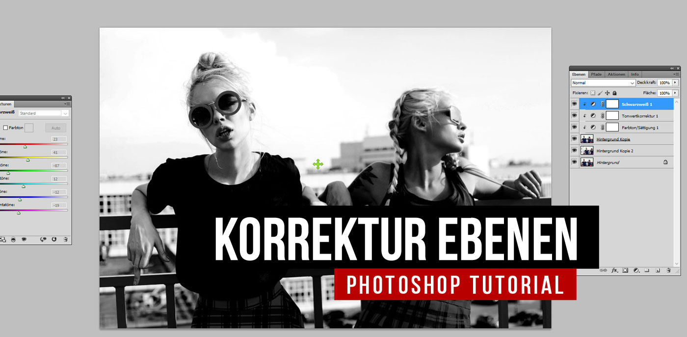
For the actual color correction prior to conversion, it’s worth taking a look at the basics of color correction in Photoshop, since many subsequent discrepancies can be specifically prevented in the original RGB file—for example, by intentionally using more subdued saturation for critical hues. Resolution and color mode should also be checked together, since a high-resolution file that has already been used for the web will no longer provide the quality required for simultaneous print use after image compression.
- Clearly specify the color mode before uploading
- Don’t blindly trust automatic conversion
- Use a more subdued saturation for critical shades
- Do not use compressed web files for printing
If you firmly establish this distinction between RGB and CMYK workflows in your own process, you won’t have to renegotiate it for every new project. This not only reduces back-and-forth between the design team and the print shop, but ultimately speeds up the approval process for larger campaigns with multiple parallel output formats.

Screen Time in Marketing: Capturing Attention in an Oversaturated Media Landscape

CMYK: The Color Model for Printing, Explained Simply

Optimize Your Job Posting: Attract More Applicants and Better Candidates

OOH: Out Of Home agency for outdoor advertising - posters, screens, events

Virtual Reality (VR): Definition, Factors & Function

Shared Media: Definition, Meaning and Strategy in the PESO Model

















 4.9 / 5.0