
Designing a Brochure: Formats, Folding, and Layout
A brochure conveys more information than a flyer, yet remains more tangible than an entire magazine. It is precisely this middle ground that makes it so popular in corporate print communication, whether as a product catalog, an image brochure, or an informational booklet at a trade show booth. Precisely because it offers more space for content than a flyer, it’s worth carefully planning everything from the format to the binding style as early as the conceptual phase.
Specify the format and structure
The first decision when creating any brochure is the format and number of pages, as both directly affect production costs and reading habits. DIN A4 and DIN A5 are the most common formats because they fit easily into binders, pouches, or mailing envelopes.
Practical tip: Page numbers in bound brochures should always be divisible by four; otherwise, the printed sheet will have blank or missing pages that won’t be noticed until the proof is reviewed.
In addition to the format, the structure is key to readability: a clear table of contents, consistent chapter colors, and a well-thought-out visual style help convey even longer content in a clear and organized manner—just as is the case with corporate publishing for client magazines.
- DIN A4 or A5 as the standard
- Page number divisible by four
- Using Chapter Colors for Orientation
- Table of Contents for Longer Documents
An Overview of Folds and Binding Styles
Not every brochure is bound; many are simply folded single sheets. The roll fold stacks three sections on top of each other, while the zigzag fold alternates between folding them forward and backward, ensuring that both sides remain equally visible. For more extensive content, however, binding methods such as saddle-stitch or perfect binding are used, which hold larger numbers of pages together securely. Anyone who has familiarized themselves with the basics of print design can usually recognize the common types of folds just by looking at the finished sample.
- Wrap-around pleat for classic three-piece suits
- Zigzag fold for visibility on both sides
- Saddle-stitch binding for up to about 60 pages
- Adhesive binding for thicker brochures
Design that fits the brand
A brochure is often the first printed point of contact with a brand, which is why typography, color schemes, and visual language should consistently follow the overarching style guide. The choice of paper also contributes to the overall impact, as high-quality cover stock conveys a very different sense of value than thin, standard paper. Anyone planning a brochure for a trade show should also keep in mind that it is often viewed alongside roll-ups and booth displays, as described in the article on trade show design. Captions, page numbers, and footers should also be designed consistently so that the brochure appears cohesive across all pages. Ultimately, what matters is that the content and design are so well coordinated that readers can intuitively navigate the pages even without instructions.
- Using a Style Guide as a Design Framework
- High-quality cover paper for a premium look
- Consider how it interacts with trade show materials
- Intuitive navigation through the pages
Prepress for Brochures
Before a brochure actually goes to print, it’s worth performing a final technical check of the file. This includes ensuring that the page order and orientation are set correctly for the chosen binding method, since otherwise the front and back pages may overlap with each other in some types of folding. Image resolution and color mode should also be checked before submission to avoid any unpleasant surprises in the proof later on. If you also want to offer the brochure in digital format, it’s best to plan for two versions of the file from the start, since print and screen versions have different requirements for resolution and color space.
- Set the page order to match the binding method
- Check the resolution and color mode before submission
- Plan the digital and print versions separately
- Check the proof before mass production
Common Mistakes in Brochure Projects
Many problems with brochures don’t arise from the design itself, but from the planning that comes before it: the number of pages and format are determined before it’s even clear how much content is actually needed. The result is either overcrowded pages or a lot of white space, because the content doesn’t fit the structure that was chosen beforehand. The binding method is also sometimes decided only shortly before printing, even though it affects margin spacing and page layout right from the layout stage.
Another common mistake is inconsistent visual style across pages when images from different sources are compiled without being edited to match.
- Determine the page number only after planning the content
- Incorporate the binding style into the layout early on
- Standardize visual elements across all pages
- Using White Space Deliberately Rather Than Randomly
Brochure as part of a broader print strategy
A single brochure usually achieves its full impact only when used in conjunction with other materials. Those who use brochures as an integral part of a print strategy plan print runs, distribution channels, and update cycles from the outset, rather than treating each project in isolation.
The question of how to technically submit a brochure correctly when ordering from an online print shop is also part of this broader context, especially when multiple versions of the brochure are being produced simultaneously.
- Plan the print run and distribution channels in advance
- Make sure to schedule the update cycle
- Check the printing company’s technical requirements
- Coordinated Production of Multiple Variants
By determining the format, binding style, and paper selection together with all stakeholders as early as the concept phase, you can significantly reduce the number of revision cycles between the first draft and the finished, printed brochure. Especially when there are multiple rounds of review, a clear, written decision pays off more than a verbally agreed-upon compromise that is later remembered differently by different people.
Brochure: Definition, Benefits, and Use in Marketing

Emotions in Marketing: How Emotional Advertising Influences Purchasing Decisions
Print Media: How Print Is Gaining Relevance in the Digital World
CMYK: The Color Model for Printing, Explained Simply
Color Profiles in Printing: ICC Profiles and Color Management Explained
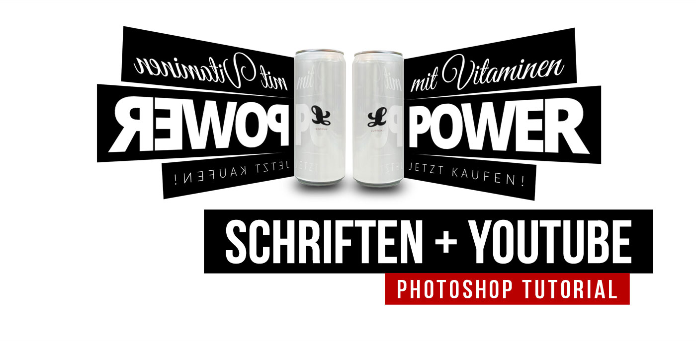
Typography in Print: Choosing Fonts for Flyers, Posters, and Brochures












 4.9 / 5.0
Leave a Reply
Want to join the discussion?Feel free to contribute!