
Designing Posters: Formats, Impact in Outdoor Spaces
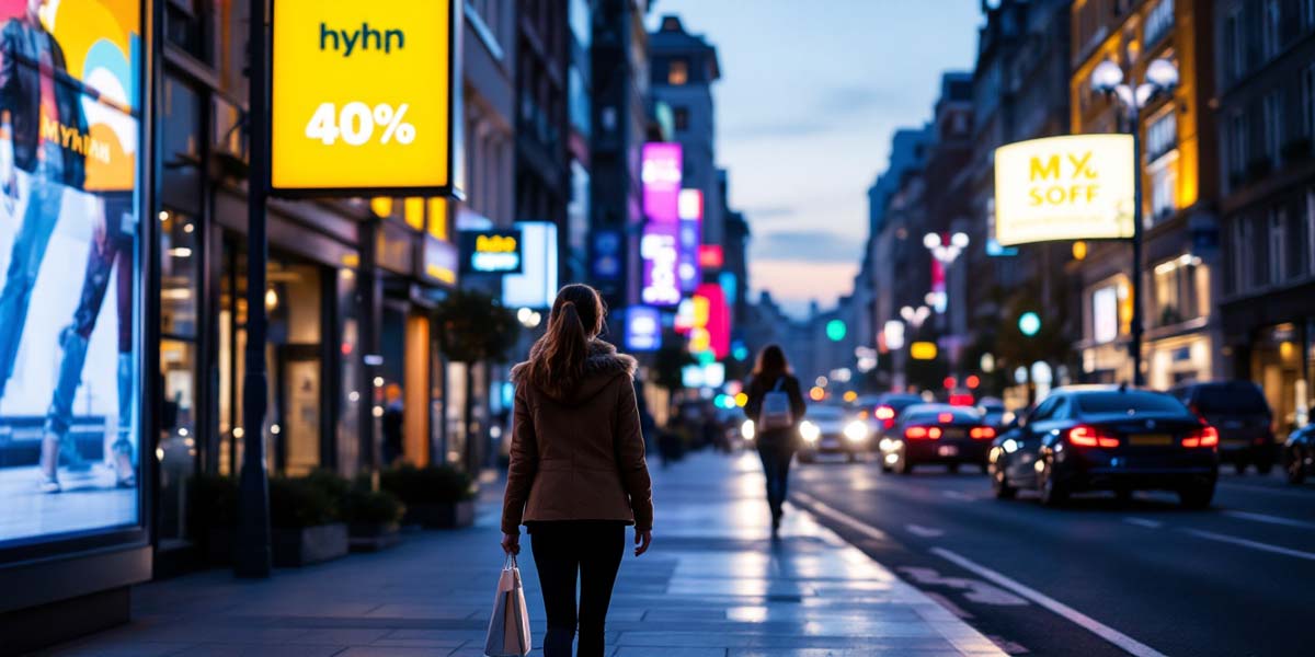
A poster often has only a few seconds to convey a message, usually as people walk by or from inside a moving car. This unique situation clearly distinguishes poster design from other printed materials and is also described as a key challenge in the article on out-of-home advertising. Especially in public spaces, first impressions often determine whether a message is noticed at all.
Formats and Standard Sizes
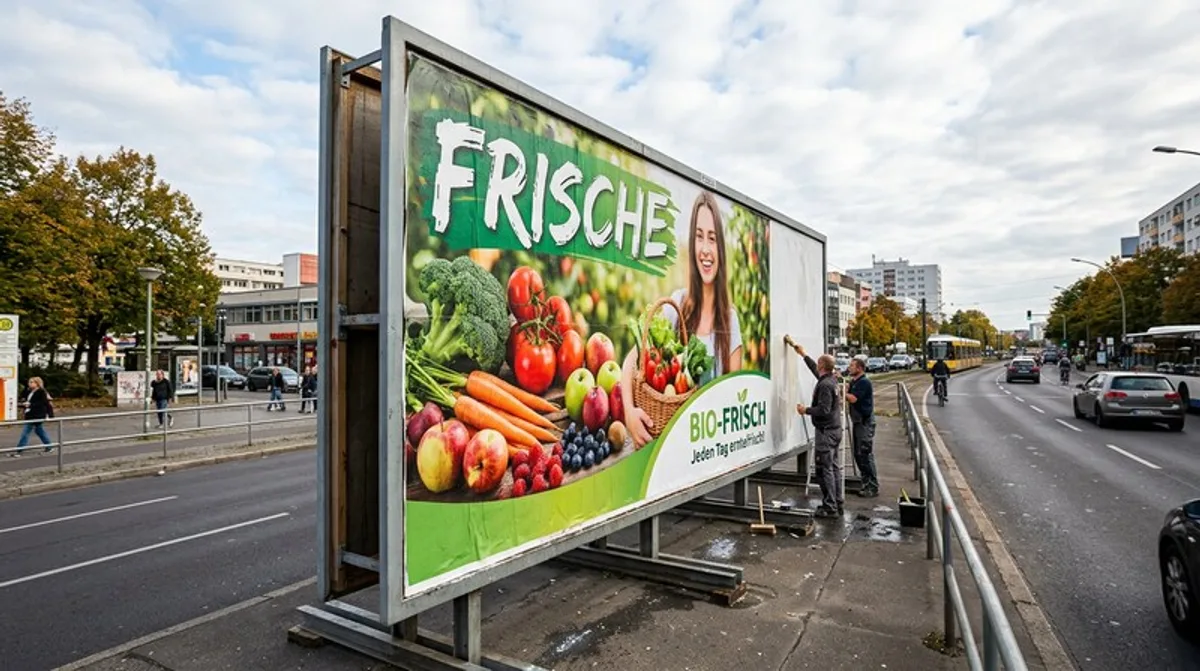
Posters come in many sizes, ranging from small A1 displays in store windows to massive 18-sheet billboards along busy streets. The larger the format, the greater the viewing distance tends to be, which has a direct impact on font size and the level of detail in the design.
A rule of thumb based on practical experience: Text on large-format posters should still be legible from a distance of about 20 to 30 meters; otherwise, the message will be completely lost as people drive by.
Smaller formats, such as DIN A1 or A0, are better suited for situations where viewers are at a short, close viewing distance—for example, on advertising columns, at bus stops, or in entrance areas, where passersby view the image from just a few meters away.
- 18-sheet sheet for heavily trafficked roads
- A1 and A0 for close-up viewing
- Adjust font size to viewing distance
- Large format results in less detail
Design Principles for Maximum Impact
Because posters usually only get a quick glance, minimalist design almost always works better than cluttered layouts. A strong image, a short message, and a clear hierarchy between the motif, headline, and brand are often enough to capture attention. Too much text or too many details simply go unnoticed as people walk by—much like in print design in general, where the rules for minimalist design also apply to posters.
- A striking image that catches the eye
- Choose a short, catchy headline
- Create a Clear Visual Hierarchy
- A few lines of text instead of continuous text
- The brand is clearly visible, but not overly prominent
Site Selection and Digital Integration
The impact of a poster depends heavily on its location—such as traffic flow, lighting, and surroundings—which is why professional campaigns carefully select locations based on the target audience and visibility. Digital screens are increasingly complementing traditional billboard spaces, as described in the article on digital outdoor advertising, allowing the imagery to change depending on the time of day or target audience. Regardless of the channel, consistency with one’s own brand remains crucial so that a poster can be immediately recognized, much like a well-designed logo facilitates brand recognition. Those who use poster advertising as part of a long-term print strategy also benefit from the repeat exposure at the same locations. Seasonal adjustments to the designs also help keep a poster relevant over a longer period without having to launch an entirely new campaign.
- Select a location by target audience
- Be mindful of lighting and traffic flow
- Digital Screens for Changing Images
- Consistent brand management across all channels
Poster Advertising in the Media Mix
A single poster rarely achieves its full impact when viewed in isolation. It is only when combined with other channels—such as online campaigns or print ads—that a recognition effect is created, anchoring the message repeatedly in the target audience’s daily lives. Many companies therefore use posters specifically to announce major campaigns or product launches, while digital channels provide in-depth content. It is important that the visual language and core message remain recognizable across all channels, even if the specific format varies significantly. For example, a poster design can be repurposed in a condensed form as an ad or social media post without losing its recognizability.
- Posters in conjunction with other channels
- Recognition Through Multiple Touchpoints
- Announcements for Campaigns and Launches
- Core message consistent across all formats
Common Mistakes in Poster Design
The most common mistake with posters is cramming too much information into a space that only gets a few seconds of attention as people walk by. If small font is also used for additional information, the actual message is completely lost because passersby simply don’t have time to take in multiple layers of text at once. Insufficient contrast between the image and the background is also often only noticeable once the poster is in its final location, when weather conditions or backlighting further diminish its impact.
Another common mistake is booking an advertising space—for example, through providers as described in the article on booking outdoor advertising —without first checking whether the design is even suitable for the specific viewing angle and distance.
- Avoid having too many layers of information
- Check contrast under real-world lighting conditions
- Do not reserve space until after the design test
- Keep the message easy to understand at a glance
Posters in Urban Spaces: Special Formats
In addition to traditional large-format billboards, special formats are gaining importance in urban spaces—such as subway marketing displays, where passengers view the design up close for an extended period of time rather than just as they pass by. This proximity allows for a higher level of detail and more text than on a traditional street billboard, but it also fundamentally changes the design logic.
Anyone using posters as part of a broader campaign mix should plan a separate, customized design for each type of location, rather than applying a single layout unchanged to all types of spaces.
- Transit areas allow for a higher level of detail
- Proximity to the viewer changes the design
- Plan a unique design for each type of location
- Do not transfer the layout unchanged

Trams and Suburban Trains as Advertising Spaces: Transit Marketing in Public Spaces

Subway Marketing: OOH Advertising, Transit Media, and Guerrilla Marketing in the Subway
Print Media: How Print Is Gaining Relevance in the Digital World

CMYK: The Color Model for Printing, Explained Simply
Color Profiles in Printing: ICC Profiles and Color Management Explained
Typography in Print: Choosing Fonts for Flyers, Posters, and Brochures















 4.9 / 5.0
Leave a Reply
Want to join the discussion?Feel free to contribute!