Adobe InDesign: Video tutorial for layout, pages and text linking – free tutorial
In my new tutorial, we’ll take a look at how Adobe InDesign works in its basics! Link text boxes together, distribute text on multiple pages, work with frames, set lines and line widths but also fonts in InDesign.
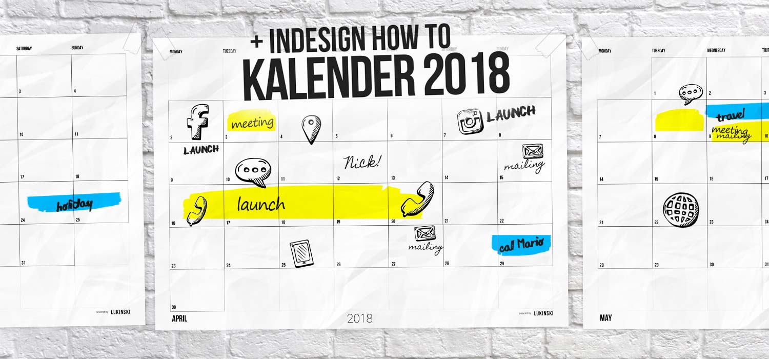
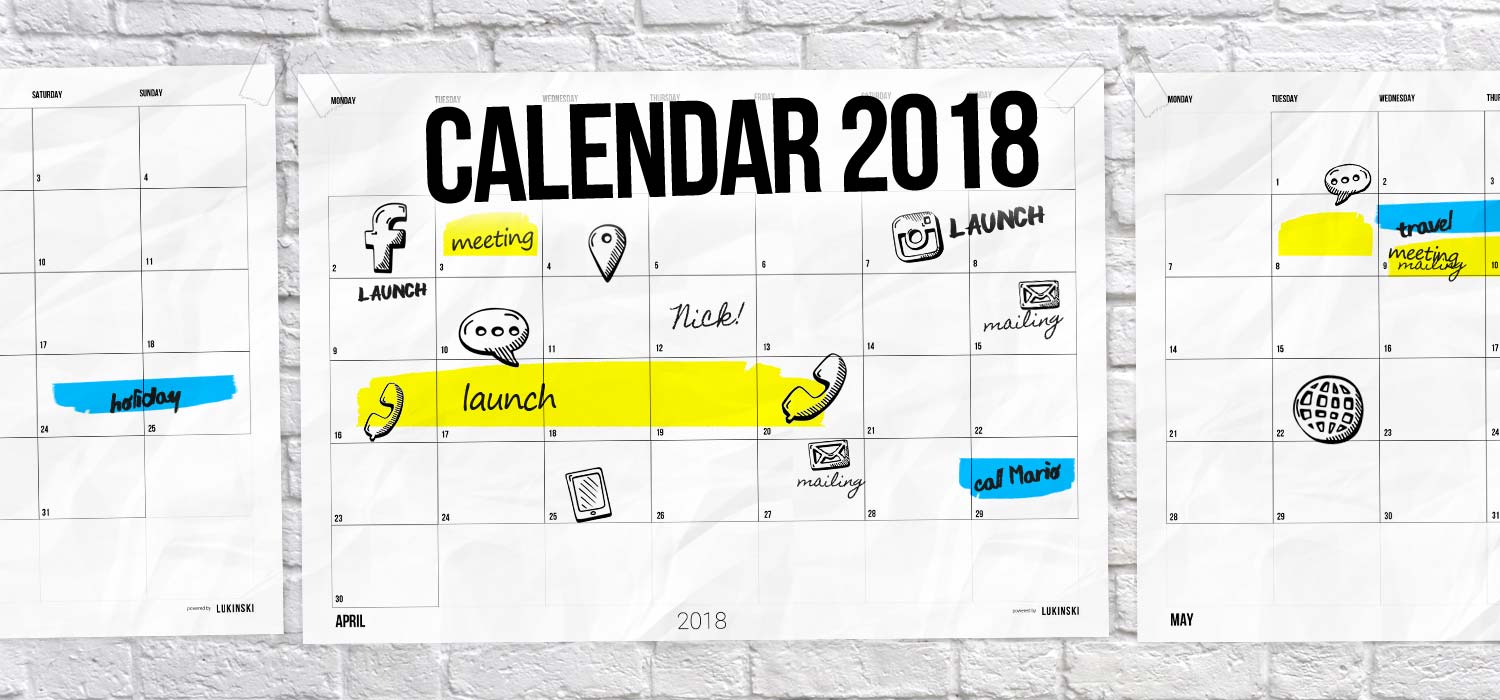
Video Tutorial: Create Case Study Calendar
I wanted a simple calendar! The tutorial video came about because I did not find a calendar last week, I had actually planned that I soon have a large calendar hanging in our agency, in which I can easily enter the most important dates and appointments. Without complex project management, without software tools, a simple calendar for 2018 and all months, from January to June, July August and December.
Since there was no suitable collection for me on the Internet, I quickly made myself a yearly or monthly calendar with InDesign and that’s when I got the idea, I should record it! Because with the help of a calendar you can learn all the basics of InDesign excellently:
- Create project file
- Frames and boxes
- Lines and strengths
- Create pages
- Linking texts together
- Font and font size
Check out my free online courses on InDesign, Photoshop and co. on Youtube now: Lukinski Advertising Agency.
Link texts, calendar & co. – this is how it works<
If you want to just download the finished calendar, you can find my 2018 Calendar PDF and Print article here.
InDesign: Layout for magazines, brochures, booklets and journals.
InDesign is an excellent tool for creating complex layouts that are spread over several pages. These are e.g. image brochures, magazines but also whole books. If you’ve been following me for a while, you’ve seen one or two of my books – each one created with InDesign! At first you would think that it is quite difficult, because InDesign has a very complex structure at first sight. The interface of the software has a lot of different settings, a lot of tools but you don’t need much!
- InDesign is used for layout and design
- Magazines, image brochures, books, etc.
- Surface is initially complex
- Important tools are easy to learn
InDesign is a bit like Photoshop, you have a lot of features but in the day to day life of an advertising agency, social media or online marketing agency, you only really need the fewest tools and utilities in graphic design.
On the basis of the calendar you can actually see all the important functions, from the use of frames to lines, text, text boxes and of course the expansion or linking of individual text boxes. In the end, our layout is duplicated on several pages and another one is adapted. If you want to learn InDesign now, check out my new video tutorial with all the basics you need to design in InDesign!
Who uses InDesign? Graphic designers, advertising agencies and publishers
As I just described with my book design, the use of InDesign is very diverse. From established newspapers, as well as the largest German BILD. Up to fashion magazines but also all image brochures for companies of advertising agencies, partly even for business cards.
Advantages of InDesign
The advantage of the software is that layouters and editors can work together, which also means larger teams. While the layouter takes care that the magazine issue with all its 120 pages looks good and is also perfectly distributed on the 120 pages, editors take care of the image and text content.
Once the layout has been created, the editors come in and fill their texts into the text boxes provided. The most important content is therefore always written at the beginning of articles, should something need to be cut out at the end. For this purpose there are various placeholders for the image material, editors can insert images in these frames and they will only be visible within the frames. Thus, there are no shifts in the text and image flow.
InDesign is a really great tool for any concepts from flyers to brochures, books, newspaper and magazine.


 4.9 / 5.0